When Covid hit and overnight people transitioned to work from home, many urbanites made the decision to relocate – at least temporarily – to a place where they could have a “better” quality of life, including a bigger house, a yard for their kids, better proximity to family members or outdoor recreation. One consideration impacting the decision to move is often where your personal income will go the furthest. Read more to see how regional price parities compare across U.S. cities…
A “metropolitan statistical area” (MSA) is a collection of counties with an “urbanized area of 50,000 or more inhabitants”. MSAs are always a group of complete counties, never just portions.
Income varies across MSAs and so do prices. Each is needed to evaluate the other. A job with high pay in a high-cost region may not be as good as it seems. Similarly, a region portrayed as “expensive” may not be if incomes are high.
To measure income and costs we can use per capita personal income and regional price parity data from the U.S. Bureau of Economic Analysis (BEA).
- Personal income is exactly what it sounds like, the amount of income earned by individuals in the area. Per capita means you take the total of all that income and divide it by the population (not just people who are working but the entire population including children, retired people, etc.)
- Regional price parity (RPP) measures the differences in the price levels of goods and services across metropolitan areas for a given year. RPPs are a percentage of the overall national price level in that year. A region with an RPP of 120 has prices that, in average, are 20% higher than the national average; one with an RPP of 90 has prices that are 10% lower than the national average.
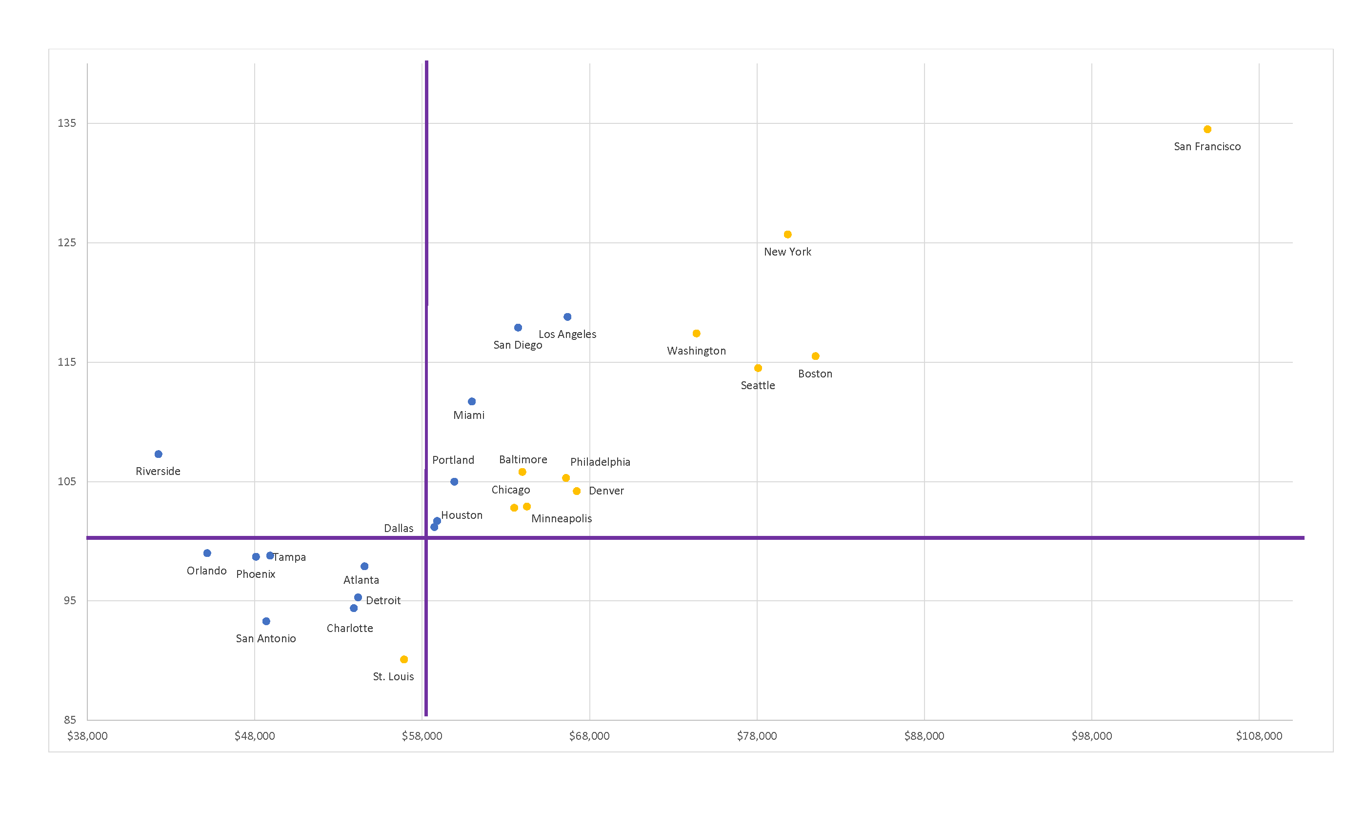
By combining these two measures we can evaluate if a high-cost region makes up for the cost with higher wages and if a low-wage region mitigates lower wages with lower costs. The chart below evaluates the 25 largest MSAs (by population). The same technique can be used for more MSAs, but after around 25 the chart becomes too crowded to be useful.

The chart is broken into four quadrants depending on if income (X-axis) is above or below the US average ($58,650) and if the RPP (Y-axis) is above or below US average. Orange dots are MSAs with income that beat the US income average after adjusting with the RPP.
TOP AND LEFT. A very bad quadrant. Incomes are LOWER than the national average and costs are HIGHER. Only the Riverside MSA is in this quadrant. It is impossible to beat the US income average in the quadrant.
BOTTOM AND LEFT. Incomes are lower than national, but lower costs make that lower income go farther. Of the eight MSAs in this quadrant, only St. Louis is in orange. The lower costs make up for the lower income.
TOP AND RIGHT. Incomes are higher than average in these MSAs, but higher costs may wipe out those higher earnings. For example, they wipe them out in Los Angeles but not Boston.
BOTTOM AND RIGHT. Higher incomes and lower costs. The best quadrant, but blank because none of the top 25 MSAs meet these criteria. There are smaller MSAs that do make the cut. Midland, TX is an example of an MSA with income substantially higher than the US average and with an RPP lower than the US average.

